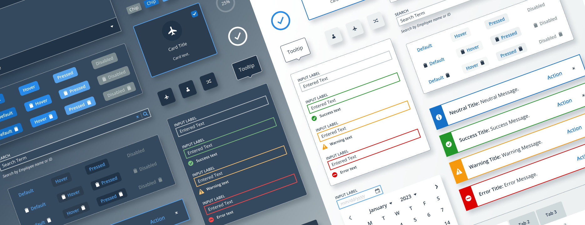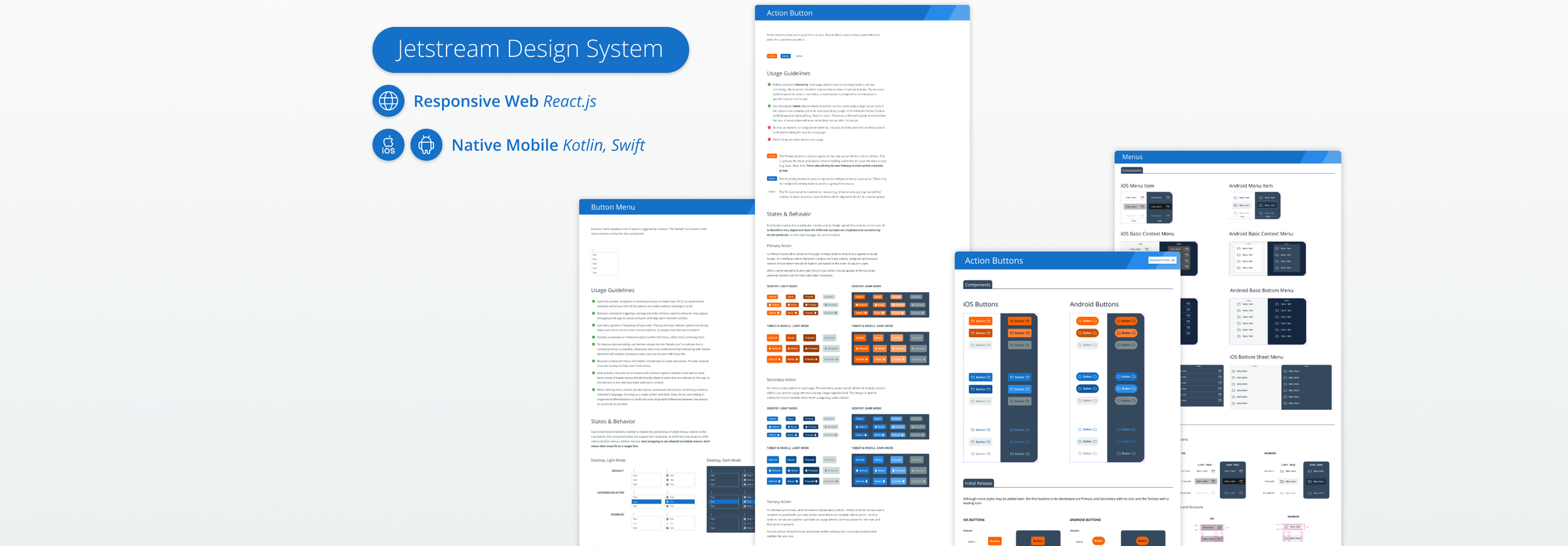
Jetstream Design System
Client: Southwest Airlines
My Role: Design System Designer & Manager
Team: Front-End Architect, Front-End Developer
Users / Personas: Product Designers, Engineering Teams, Southwest Internal Users & Crew Members
Tools Used: Sketch, Zeplin, Abstract, Airtable, Storybook, Miro, Figma
Background:
As post-quarantine business and travel slowly resumed, we knew firsthand that a central Design System would provide the highest business value and the best outcomes for internal teams and customers. Our Southwest partners agreed and placed enormous trust in us to deliver, manage, and guide teams in their adoption of the unified Design System.
Goals:
Create a channel agnostic Design System: a unified standard and central set of resources to ensure consistency and best-in-class product delivery at enterprise scale
Evolve org-wide UX maturity through the Design System
Help teams adopt the Design System effectively
Establish a customer-centered expansion and governance model
Challenges:
Internal tools lacked a unified set of design standards, resulting in an inconsistent appearance and confusing disconnects across user experiences.
Internal teams lacked a unified front-end development strategy, with widely varying levels of front-end experience, leading to long, costly, and stressful production cycles.
Ongoing modernization work was adding to the confusion, as internal tools became increasingly fragmented across portals, partial updates, and legacy platforms.
The Design System must be easy to consume, as agile product teams would need to adopt and integrate it into products while achieving their existing delivery commitments.
DISCOVERY: Developing a Strategic Vision
I worked closely with the Front-End Architect to understand needs at the product and portfolio levels:
Conversations: In addition to deep user and domain experience I’d cultivated in past engagements, I sat down with teams and stakeholders across the Technology Org to fully understand the context, pain points, future needs, and metrics of success at all levels, from executive portfolio leaders to individual developers.
Portfolio Audit: I mapped the entire UI product portfolio, including each product’s users, supported devices, channels, and build team.
Alignment Workshops: After consulting with product-level SMEs, engineers, and stakeholders, I facilitated analysis activities with executive leadership to elevate user and delivery needs, secure buy-in, and define the tech stack for the foundational library in the design system: a responsive web-based component library. We aligned on React.js for Phase 1, with Native Mobile libraries to follow in the coming years.
Component Inventory: The FE Architect and I created an Airtable spreadsheet of all existing and needed components according to complexity along with notes to guide dev and design.
Project Management & Roadmap: I worked closely with product owners to roadmap the design and delivery of components, creating a prioritized product backlog in JIRA which all teams could easily reference.
We prioritized initial “core components” based on shared application patterns that we knew would save the most time and effort for dev, and worked with product teams to prioritize the remaining components based on their upcoming dependencies.
Anticipating a learning curve, we allocated extra capacity from myself and our 2 devs to help engineering teams implement components during their first few sprints using the library.
This was an aggressive timeline, especially for a team of 3, but thanks to strategic planning and communication, we delivered as promised and on-schedule.
DESIGN: Creating the Design System
As the designer responsible for creating the Design System, I performed the following tasks:
Planning and analysis, design and documentation of components and guides, close collaboration with product teams, and constant attention to maintaining high quality and design consistency throughout the project.
Standardizing the Design Foundations: Typography, Color, Theming, Grid Layouts, Icons, and Accessibility Guidelines.
Collaborated with Marketing to develop an accessible brand-approved color palette for the unique needs of Southwest’s enterprise digital tools.
Worked with engineering to translate these foundations into scalable front-end theming.
Created all components with light and dark mode variants, and optimized them for accessibility and responsive usage on all major device types and channels.
Defined the appearance, behavior, and structure of components, considering product requirements, technical limitations, and user needs.
DESIGN OPS: Shaping & Establishing Processes
Reviewed components with engineering and product teams prior to development for alignment and integration success.
Reviewed and tested the developed components alongside front-end developers to ensure quality prior to their release.
Established standards and guidelines for applying the Design System components, building Sketch symbols to mirror developer options and variables so designers learn what’s possible and gain a shared frame of reference.
Created unified documentation and guides for applying the Design System to facilitate easy adoption by designers and product teams.
Worked closely with the Front-End Architect to create the Design System’s Docsite in Storybook, integrated with published designs in Zeplin, to act as a single source of truth driving clarity and consistency between development and design.
Collaborated across disciplines discussing design decisions, exchanging ideas, and incorporating feedback, to continuously improve the user experience of the Design System’s components and documentation.
INTEGRATION: Guiding Adoption
Here are some of the methods we used to help enterprise teams adopt the new Design System:
Component Library Office Hours and Slack Channel: A weekly meeting and asynchronous channel where teams could get hands-on help from our small team, offer feedback, and collaborate on common challenges.
Single Source of Truth: Our docsite in Storybook acted as a single entry point, connecting each component with its accompanying documentation and designs in Zeplin for scalable consistency across design and implementation. We organized the docsite for clarity and way-finding, drawing on familiar mental models and shared language so designers and devs could easily find the components and information they needed. To help product owners monitor dependencies, components were labeled and linked to JIRA for easy visibility and status tracking.
Agile Training: Throughout and following its creation, we leveraged agile ceremonies like planning and end-of-sprint demos to present the Design System and its components. This facilitated feedback loops, surfacing future needs, demonstrating the benefits, and training teams to adopt it effectively.
Component Kick-Offs: I regularly joined refinement meetings to introduce components in context, helping developers understand them in relation to user needs and their upcoming work. I also used this time to gather feedback, discussing different developers’ experience using my product (the Design System) to build theirs.
Buttons - Primary & Secondary States
Sidebar - Tab Order for Accessibility
Notifications - Toast Positioning and States
EVOLUTION: Managing the Design System
After its successful launch and delivery, I was responsible for effectively managing, evolving, and ensuring the consistency and usability of the Design System. Building upon the strong foundation, my work focused on developing new components, standardizing patterns, and supporting teams in using the Design System’s components and processes.
Governance: Defining and implementing a scalable agile governance model to provide UX direction as the design ecosystem evolved.
Expansion: Creating processes for communicating new component requests, so teams understood requirements, reasoning, and what to expect.
Planning: Coordinating with product owners to prioritize around dependencies, identify new component needs, and ensure successful delivery.
Design Quality: Researching new methods, continuously refining file structure, symbols, and components, and ultimately migrating the Design System to Figma for optimized design delivery along with integrated collaboration and prototyping.
Dev Quality: Collaborating to continuously clarify and refine the docsite documentation, providing dev and integration support, tailoring handoff processes to support a productive, user-friendly developer experience.
Growth: Consulting across the airline, guiding new teams to adopt the Design System for their next generation and greenfield UI projects.
Improvement: Conducting retrospectives to learn where we could improve the Design System and its processes. We polled end users on usability, and standardized common use cases and patterns to streamline consistent implementation across product lines as the teams gained familiarity with the Design System.
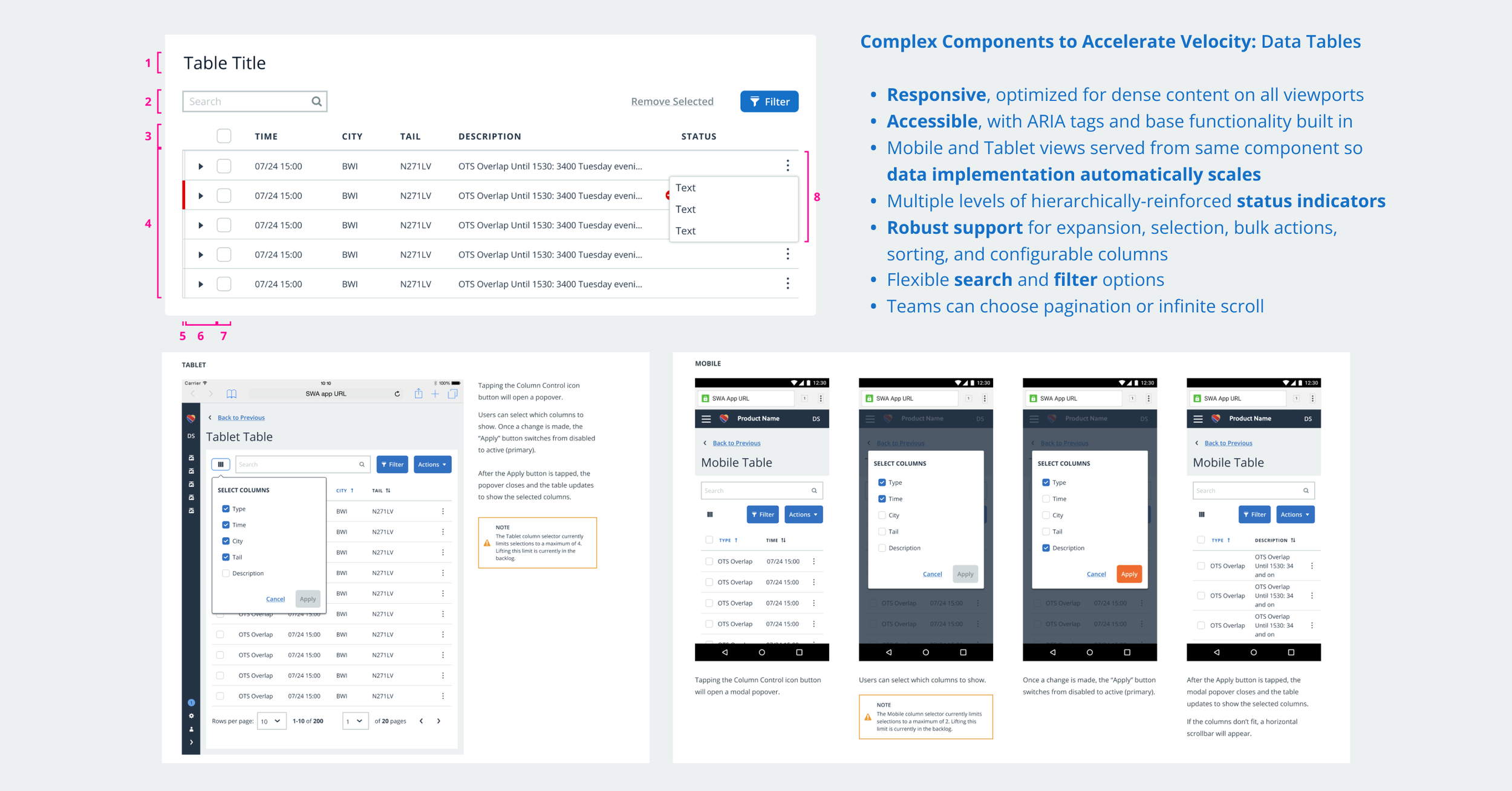
Patterns - Expanding Data Tables
Pattern - File Uploads
Patterns - Filter Drawer
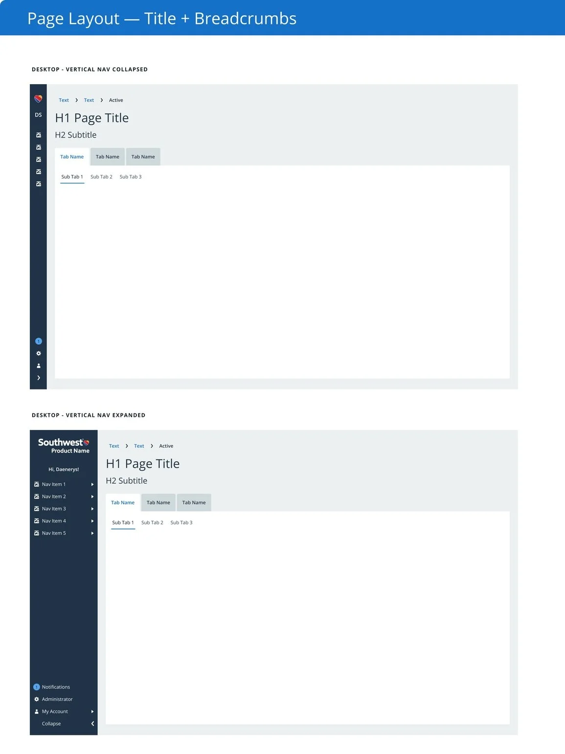
Patterns - Page Layout Template
The Results:
In its first year, the Design System and React CL supported 9 internal product across 6 product lines, improving efficiencies and reducing development time by an estimated 30 weeks for each product, a savings we could provide by ensuring teams did not have to build richly featured global components like navigation and data tables.
Adoption of the Design System significantly increased org-wide UX maturity, improving user experience and consistency across products while organically establishing a baseline for more effective user-centered design, development, and delivery practices.
Successfully reduced development time, effort, and costs, as ready-made solutions saved time, prevented tech debt and rework, and allowed UI enhancements to common components with minimal impact to individual teams’ velocity.
A unified language and cohesive elements not only improved user experience by making products more intuitive and user-friendly, but freed up time for product teams to engage more with users, experiment, and deliver features their internal customers needed.


