Saturn Design System
Year: 2020
Duration: 8 months
Role: Sr. Experience Designer
Team: Experience Director, Design Technologist, 3 Front-End Developers, 2 fellow Experience Designers
Tools Used: Pencil & Paper, Adobe XD, Adobe Illustrator, Airtable, Miro, Zoom, Google Sheets (Notetaking)
Responsibilities:
Creating and documenting Design System components and patterns alongside fellow designer Jinny Seo
Providing design support and collaborating with engineers to implement components and build designs for the best possible user-experience
Summary:
What started as a three-month UI and component library project turned into an 18-sprint partnership, all conducted remotely across timezones.
Our team delivered a design system in React.js and Adobe XD to unite all of OpenMarket’s product development efforts.
Our team redesigned the UI and optimized user experience for Indigo, OpenMarket’s flagship SaaS product.
“Thanks everyone. This project wasn’t just a simple “build a design system and some components to match it.” This project was: learn a new industry, identify the problems that go along with that industry, create solutions for those problems, incorporate them into a design system and cement them in code… all while your client changed courses a few times. It’s a tremendous project you’ve delivered. Your whole team is world class.”
— Mike King, VP Engineering of OpenMarket
Background:
OpenMarket makes mobile marketing easy through user-friendly software for creating and managing SMS campaigns. The company’s robust network of web service APIs allows enterprise clients like SkyNews to coordinate massive global campaigns while optimizing for success in specific markets.
In addition to its API services, OpenMarket’s flagship product, Indigo, provides an intuitive conversation builder allowing non-technical users like marketing managers to create SMS, RCS, and other types of text-based messaging campaigns. Users can track engagement and manage all their campaigns from one dashboard.
Challenges:
OpenMarket’s flagship SaaS product, Indigo Create, felt fragmented, and its visual identity wasn’t resonating with the smaller companies and teams that now made up its target market.
A lack of unified development standards led to slow delivery timelines, usability issues, and poor product performance.
Creating the Design System
As one of three designers tasked with creating the Design System, I contributed at all stages from inception to integration. Our team performed the following tasks:
Consulted to understand industry context, future needs, and metrics of success for the designers and developers consuming the Design System.
Inventoried all existing brand assets, color, type, icons, components and patterns used across current product UIs, to ensure that the consolidated designs and components support all needed functionality.
Defined necessary components based on existing UI functionality, customer needs, supported devices, and accessibility requirements.
Created component backlog, working with developers and product teams to define individual component requirements.
Created the architecture of the Design System by first standardizing the Design Foundations: Layout Grid, Color, and Typography.
Created all components with light and dark mode variants, and optimized them for responsive mobile-first usability across all major device types and viewport sizes.
Carefully designed all components for inclusive accessibility in compliance with ADA, WCAG 2.0 (AA), Section 508 & EN 301549, with detailed implementation guidelines to support assistive technology such as keyboard browsing and screen readers.
Reviewed components with design technologist and engineering managers prior to development for alignment and integration success.
Established guidelines in Adobe XD and Storybook for applying the Design System components and elements to ensure a supportive user experience and consistent visual identity across product lines.
Worked with distributed engineering teams, providing design support to build the responsive, WCAG-compliant React library optimized for assistive technology.


The Design System + React Component Library:
Enterprise-level Design System. Designed in Adobe XD, developed using React.
Designed for international communications and marketing, this component library includes features like:
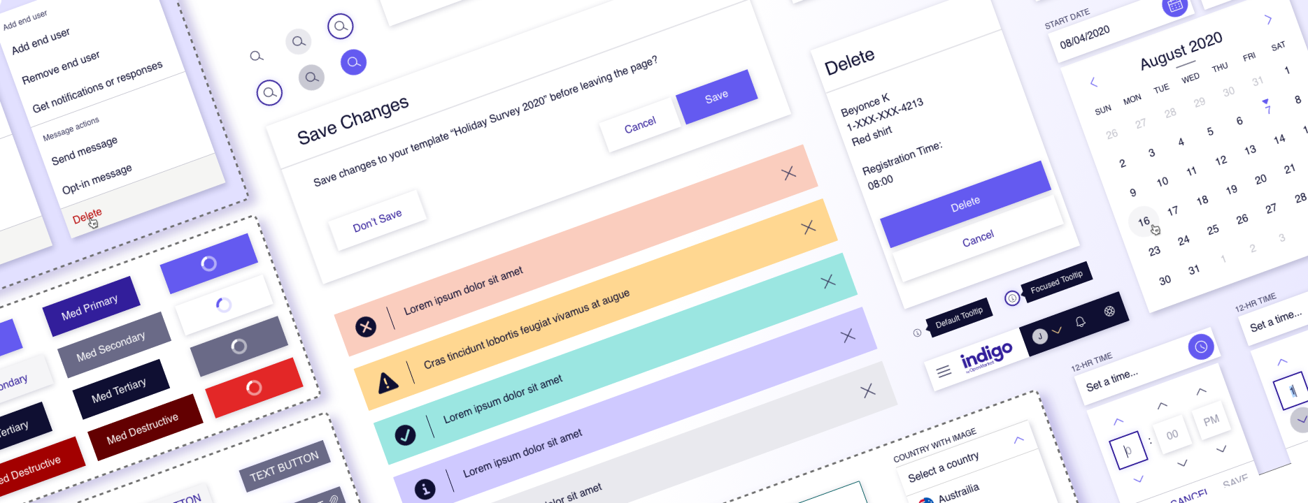
40+ accessible, responsive web components with light and dark mode theming, designed for desktop, tablet, and mobile viewports
Date and time pickers with support for single dates, ranges, and international localization
Robust data tables with support for sorting, filtering, selection, bulk actions, and freezable columns
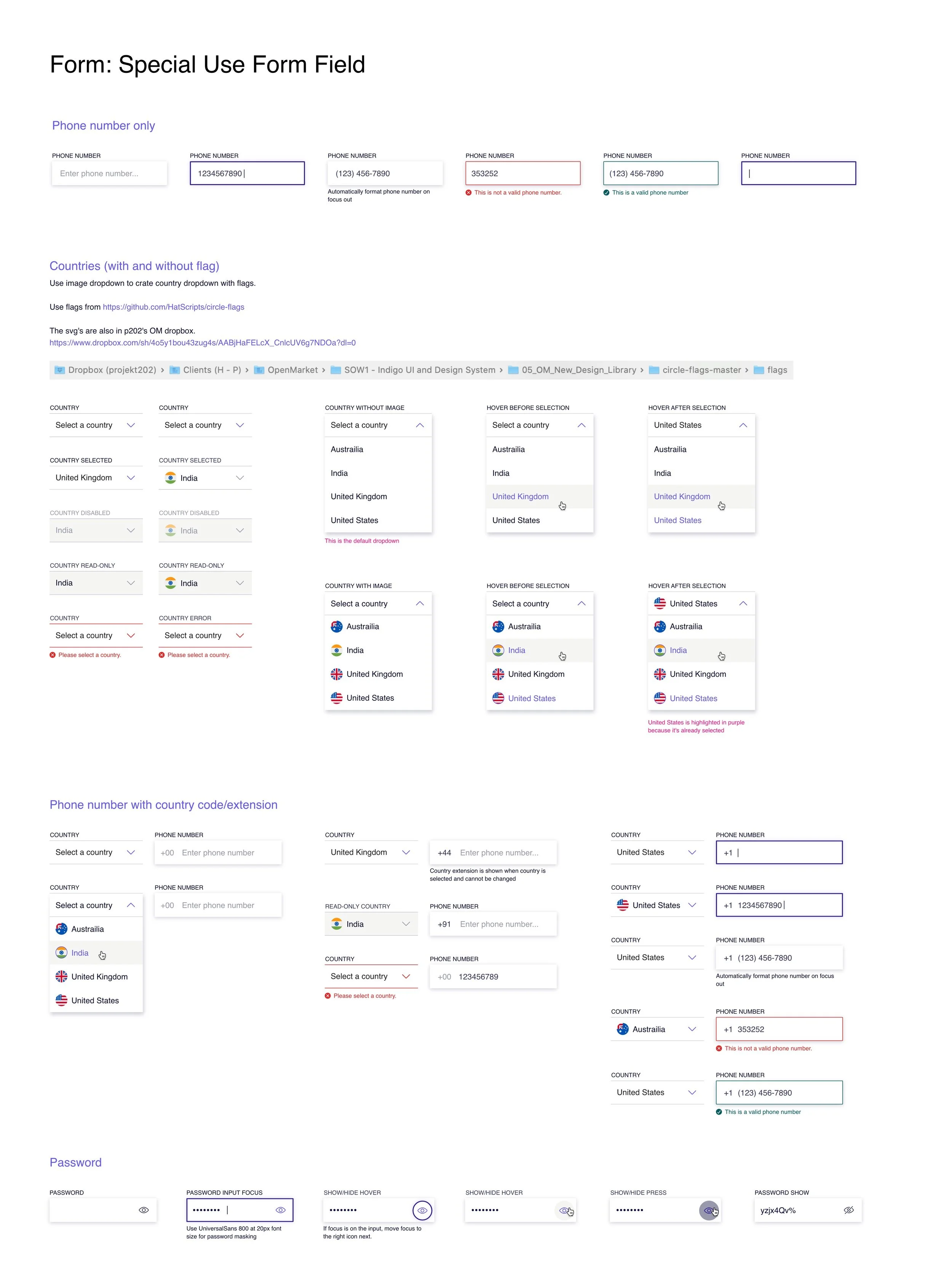
Special input fields with built-in country-specific localization for phone numbers, currency, flags, and even password validation
Several varieties of state-based accessible mobile-friendly messaging components to support communications in all contexts
Accordion - Accessibility Guidelines
Date Picker - States
File Upload - Responsive Breakpoints
Form - Special Use Input Field
Modal - Spacing & Touch Targets
Time Picker - Overview, Timezones, Dialog Specs
Toast Message - States
Tooltips - States


